I picked up the catalog for the show "The Great Mother: Women, Maternity, and Power in Art and Visual Culture, 1900-2015" curated by Massimiliano Gioni in 2015. Great essays and interviews on how the image of the mother has been interpreted over the last 100 years or so under various socio-political and artistic movements over time. The exhibition featured male and female artists who challenged in their own creative manner the projected social constructs idealising the image of the mother at the time.
exhibition
I cannot easily shake off the village. -Thoreau /

'Good Grief!' was on last week and was well received. I performed (with a guest) and I really enjoyed the experience. I had planned to spend the whole opening inside the structure. I cannot easily shake off the village. - Thoreau was about my ideal form of escape: a structure that would serve as both a workspace on its upright position and as a resting space once lying on its side. Moving, lifting, & tilting of the structure all had to be performed by myself. I saw these basic tasks as fundamental in representing effort in seeking some personal space to think or to relax.
Upcoming Group Exhibition: Artist Residency in Parenthood /
Pretty excited to be part of this show in Sydney! I had the chance to meet with Lenine Bourke, whose idea it was to put together this show. There's a great selection of artists working with various media. There are two other artists from Melbourne, my fellow art-mums friends Clare Rae and Nina Ross. I'll be attending the panel discussion on Feb 6th and will be looking forward to meeting and greeting friends and other artists.

Upcoming Exhibition /
Here's the invite for an exhibition I've been slowly preparing for the past few months. Here's the statement for the show:
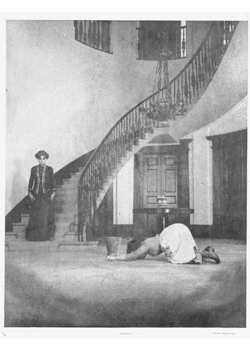
"In horror stories or in fairy tales, the fascination with the morbid is a way to prepare for the unthinkable". Cindy Sherman

Family Fantasy is a three-part installation exploring isolation: a model house, a photograph of a kitchen, and a constructed wall suggest sites where control over access to the outside is challenged. This exhibition was inspired by the artist?s experience living in Cleveland, Ohio in 2013. During the same year, three women were rescued from the house of their kidnapper Ariel Castro in Cleveland, Ohio. The women had been sequestered for ten years.

Lydia Wegner "Assemble Colour" at Arc One Gallery /

Light Foil
2014
84 x 65 cm
Archival Inkjet Print
I went to check out Lydia Wegner's latest photo series at Arc One Gallery. I remember seeing her early works when she was still doing Honours at VCA back in 2011. I've always loved her minimalistic arrangements with found objects. I really enjoyed this show for the use of bright and bold colours throughout the photo series. Before seeing this show, I've never considered using coloured frames. Wegner's carefully colour-coordinated frames proved to be worth it.
Transformer Station now showing Todd Hido /
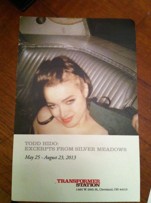
I went to see a photography show by Ohio-born artist Todd Hido at Transformer Station. Excerpts from Silver Meadows is about memory, and where Hido grew up. Some of his photos reminded me of stills from a David Lynch movie. I really liked the eeriness of those.
The gallery is worth checking out too. It’s a newly renovated substation.
Upcoming Show /
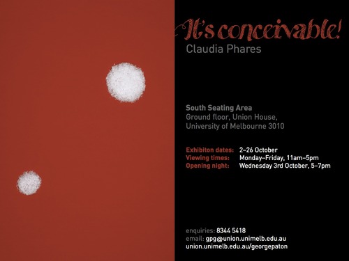
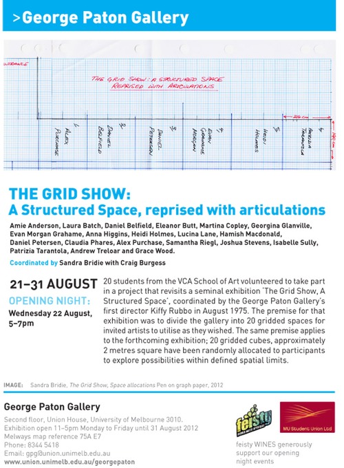
The Grid Show: Upcoming show: /
I’ll be part of this group show, as one of 20 VCA students. We were given a 2 m square space. Come and check out how we explored our space creatively.
4 things I learnt after exhibiting /
On Monday, I went to take down my exhibition at the C3 Contemporary Art Space. This was my first show as an undergraduate which turned out well. Here are a few things I learnt from this whole experience.
- Sitting in the gallery invigilating I met fellow exhibiting artist, Alyshia Boddenberg. I wasn’t familiar with her work before this show and I thought it was such a great opportunity to discover a new local artist, to learn about her experiences since she graduated (2008), and to network. We talked about shows we’ve seen, artists worth checking out, and about our current art practice.
- I learnt from C3 gallery manager, Jon Butt who commented ”Exhibiting artists need to spend time looking at their work to see how it stands in the space and if changes can be made.” This sounds familiar. Our teachers always encourage us to experiment different ways of hanging or displaying our works. Also you learn to work around things you can’t change about the space. Personally, I don’t think I could have hung the prints differently. The lighting was even so it was easy to display the works. There was an exit door, a fire hose, and a fire extinguisher on one of the walls which I thought would break the flow of my photo series. I worked around it and I don’t think it distracted too much.
- The third point has to do with experimenting with materials. I face mounted all my prints on polished perspex. The idea came from one of my VCA teachers, Janina Green, who suggested I tried it. I investigated the technique and spoke with Stephen Haley, the Graduate Coordinator of Research (MFA program) at VCA, who uses perspex mounting for his work. I found out that although the mounting is a bit expensive (but cheaper than framing), the glossy perspex finish not only accentuates sharpness and colour, but protects the print as well. On the down side, perspex can easily scratch but it can be polished back. Also, the print can peel off the perspex if it’s not mounted properly or humidity gets in. In the end, storing your work appropriately is important regardless of the media used. Colour Factory was the place to go for this kind of job. The final works turned out great and I’m happy with the choice I made. The feedback was positive.
- The last point has to do with the importance of documenting the show. I quickly found out that photographing a reflective surface is not ideal. I’m sure there is a way to avoid reflections. I’ll use installation shots and a few close ups, but the digital files are the most important for archival purposes.
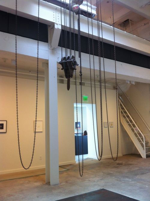
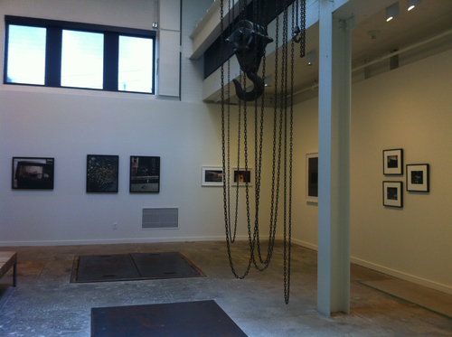
New shows at the Centre for Contemporary Photography /
Geoff Robinson
I attended the artist talks last Saturday at the CCP. Not all galleries have scheduled artist’s talks, but I find them to be the best time to find out more about the artist’s works without the hustle and bustle of openings.
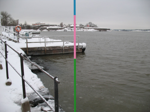
The new exhibitions at the CCP feature photo prints, installation, and video. I was fascinated with the installation by Geoff Robinson in Gallery 1. I particularly liked the use of colours in his show. I’ve got chromophilia. What’s interesting is how Robinson mapped sounds from 12 different sites off Suomenlinna Island (Finland) and transformed it into something tangible and visual such as the poles. Robinson said there is no particular correlation between the colours and the sounds. The colours are definitely a contrast to the Nordic winter tones. The link to photography is found in the video installation accompanying the installation. I think Robinson found an interesting way to share his experience in Finland, enabling the audience to closely interact with their senses.It reminds me of Olafur Eliasson’s use of the elements in his installations. With Robinson’s show, you feel transported right on site with this installation and the sound recordings. The winter scenes take me back to my Canadian winters.
On a different note, the works in Gallery 2 & 3 deal with memory. ‘Lost and Found: family photos swept away by the 3.11 East Japan tsunami’ involves Japanese artists Munemasa Takahashi and Hiroshi Hatate, and the Australian artist, Kristian Haggblom. Behind the faded anonymous images and the earthy tones, there is a confronting sadness, loss, and trauma. Haggblom said he had to remove one photo because of recognisable content. In the other gallery, Eliza Hutchison displays a series of images, some of which are distorted, which explore recollection. At times, I found the content of her series ‘Hair in the Gate, a biography’ difficult to decipher without reading the titles for each photo. The way the prints are displayed is intriguing for the way the artist arranged her diptychs and triptychs.
The next work in Gallery 4, ‘Témoin oculaire: shelter or prison: a meditation on incarceration and madness’, is a perturbing yet powerful piece by the artists Julie Davies and Alex Rizkalla. The title of their show reveals it all.
On a lighter note, Charlie Sofo's night projection video, just like Robinson's exhibition, is less emotionally charged than the rest of the CCP current shows. Sofo was part of NEW 12 at ACCA earlier this year and I appreciate the similarities between his CCP and ACCA projects. Definitely worth seeing.
Alec Soth, Broken Manual @Kelly: A Review Conversation with Richard B. Woodward /
I saw Alec Soth’s exhibition Broken Manual in Berlin in July 2011 at Loock Gallery. Here’s a review of the conversation DLK had with the Wall Street Journal arts critic, Richard B. Woodward.
Yvonne Todd at Centre for Contemporary Photography /
I attended the artist talks at the CCP last Saturday. I was particularly interested in Yvonne Todd’s work. I had previously seen Todd’s work for the first time at the NGV in 2010 during the Unnerved: The New Zealand Project. I remember being mesmerised by her portraits. Things haven’t changed since then! Her recent series shown at the CCP is just as fascinating.
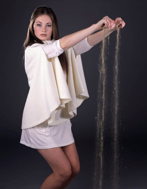
Serena Bentley curated the exhibition Wall of Seahorsel that is featured in Gallery 1 & 2 by the NZ photographer, Yvonne Todd. Seahorsel in Gallery 1 involves large scale portraits shot in studio where costumed models appeared to have been photographed while performing odd dance moves. Props like sand (see above), shells, & seaweed were used to convey a marine life theme throughout the works. The series alludes to commercial photography with a twist. I love how there is something absurd in the models’ postures. Todd explained she wanted to create a portrait series that is ambiguous and I think she has succeeded in combining mystery and theatricality in this series. She described her work as ‘deliberately obtuse’, a quote from one of her favorite authors, David Sedaris.
Senior Executive
colour photograph, 130 x 105 cm, edition of 3 + 1 ap
In Gallery 2, The Wall of Man appears, at first glance, as a series of corporate portraits of senior executives. The truth is these men were recruited by the artist who placed an ad in the local paper. Todd references the stereotypical executives portraits. They look déja vu except for the odd fingertip missing here or someone wearing sunglasses with gradient lenses there. It can feel intimidating standing in Gallery 2, sandwiched between 2 walls of men staring back at you. Behind these highly staged portraits, there is a touch of humour that is characteristic of Todd’s portraiture.
Overall, Todd’s exhibition demonstrates not only how well she masters the craft of the lens and studio work, but also shows her ability to create works that suggest the familiar in a creative manner.
Clare Rae - Light Weight /
I was at Beam Contemporary Gallery on Friday to see Clare Rae's exhibition, 'Light Weight'. The series consists of self-portrait shot in broad daylight and explores the link between performance and photography. There were two large light boxes, 100 x 150 cm, which really caught my eye. You almost feel like the artist is performing in the darkened room under a spot light. I liked the minimalist installation of the light boxes in the main space and the 3 smaller prints in the alcove. The combination of performance and photography is something I'll always be drawn to and I think Rae blended the two very well.
Kate Robertson - People, Dust, and a Whole Lot of Spirit /
Lars Nissen, Untitled 2011
Kate Robertson is part of a group exhibition held at Rae & Bennett Gallery. The show, People, Dust and a Whole Lot of Spirit, consists of a collection of photographs and archives relating to ConFest, Australia’s first alternative life-style festival.
I had never heard of ConFest before this exhibition. I discovered something new about one of Australia’s subcultures. Robertson’s images are worth checking out. Her 2 photos of falling dust were an amalgamation of several dust images taken with various media. Since these images were the most open to interpretation, there was something very captivating about it.
Iolanthe Iezzi - The man I love /
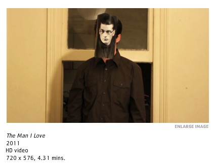
There was an opening at Dianne Tanzer Gallery yesterday. One of the featured artists is Iolanthe Iezzi whose video, The man I love, is worth checking out. Iezzi works in Melbourne in film, photography, design, installation, and short story writing. I’d be interested in seeing the rest of her work. Her video explored a woman’s loneliness and memories with humour. Simple, yet poignant.
Also worth checking out is the stencil art of the Aboriginal artist Reko Rennie and the minimalist black and white painting series, Ring Cycle, of Magda Cebokli.
10 ways to look at the past - NGV Australia /
Tracey Moffatt
Laudanum, #1, 1998
Set of 19 images
Toned photogravure print on rag paper
76 × 57cm
Edition of 60
I went to see the exhibition ‘10 ways to look at the past’ at the Ian Potter Centre-NGV Australia. The show is about the passage of time interpreted by 10 contemporary Australian artists. What caught my eye was the Tracey Moffat’s series Laudanum, featuring 19 black-and-white framed prints. The softness of the images and the composition created a mesmerising dreamscape. I got the sense of the past and I felt like I was staring at some old found photographs. There is something mysterious, haunting, and erotic in the narrative. This series would make anyone appreciate the fine art of darkroom processes.
On seeing the cinematic photography of Gregory Crewdson /

I went to C/O Berlin: International Forum for Visual Dialogues which is currently exhibiting 3 series of works by Gregory Crewdson: Fireflies (1996), Beneath the Roses (2003-2007), and Sanctuary (2010).
C/O Berlin was an old post office turned into a cultural institution dedicated to photography since 2006. It is an enormous building which has a lot of history just by looking at the floorboards and the architecture in general. Crewdson’s show occupies the top floor, where a space is allocated to each series. There are about framed 90 large-format photographs, all in colour except for the ‘Fireflies’ series. There’s a video playing an interview with Crewdson in a room at the back.
I had only seen one of Crewdson’s images in the flesh in Melbourne when the Guggenheim exhibition was on at the NGV. To see the whole series ‘Beneath the Roses’ on the wall is quite impressive. It’s my favorite series out of the three. The highly constructed images reflect the extensive planning required to complete one photo. In the hallway, there are drawings sketching out the process. I had seen videos with Crewdson at work: we’re talking about big productions here. The feeling I get with ‘Beneath the roses’ is solitude and loneliness. There is a strong narrative in the series. I’m deeply curious about the original idea from which each image was based on. There are so many interpretations that can be derived. Aesthetically, the photos are impeccable.
The other 2 series are less theatrical. ‘Fireflies’ was Crewdson’s first series done in black and white.There is something minimalist about this series where light trails left by fireflies have been captured on film. Its simplicity is beautiful. With ‘Sanctuary’, the monochromatic series is on old movie sets in Italy. The atmosphere is heavy with loneliness which is a recurring theme in Crewdson’s work, which he talks about in the interview. Overall, the 3 series work well together and are worth checking out.
André Kertész & Daniel Schwartz at Martin Gropius Bau Gallery /
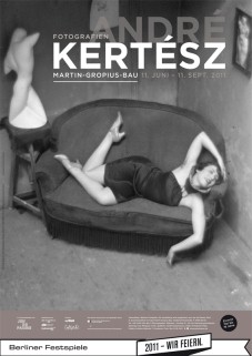
At Martin Gropius Bau is showing 2 photographers who are best known for their artistic manner in documenting what goes on around them. Being of 2 different eras, each succeeded in their own unique way to produce outstanding images. Kertész (1894-1985) has been recognised for his innovative photographic compositions and his eye for geometrical structures, shades, & silhouettes. The exhibition holds 100s of black and white framed prints of various sizes, some original publications, and a little series of coloured polaroids. Seeing Kertész’ work makes me appreciate more the work involved in black and white film photography. Is it a craft. Kertész is definitely one of my favorite black and white photographers of all times.
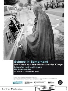
Concurrently showing was Daniel Schwartz’s exhibition “Snow in Samarkand: Views from the Hinterland of War’, where text and photography are harmoniously juxtaposed. The Swiss-born photographer is also an author who travelled in the war ridden areas of Afghanistan and Central Asia. The works are shown chronologically between 1995-2007. It documents both the socio-political and the history of these diverse geographical areas. The prints were all large (starting from 70x70cm) and framed. The accompanying text was framed and was sometimes right next to a photo and other times by itself on the wall. Previous knowledge of the socio-political events surrounding the areas he visited may help the viewer to fully appreciate the content of the exhibition. I didn’t read all the text as there was a lot. I prefer to read it in a book. I enjoyed Schwartz’s style which is somewhere between photojournalism and documentary with a great eye for composition.
Overall, both Kertész and Schwartz are photographers worth checking out to compare the way they documented the world in their own distinct way at different times in history.
Would love to check out German photographer Sigmar Polke /
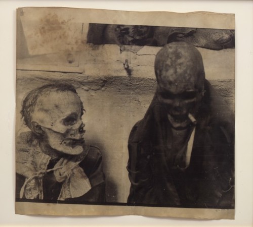
I would love to see this exhibition of Sigmar Polke at Leo Koenig in NY. Polke was a German painter and photographer who is known for his unconventional approaches in creating art works. He revolutionised the visual art world with his use of various chemicals and techniques. The photo exhibition contains a series of photographs taken between 1964-2000 at the Capuchin catacombs of Palermo and a series of photograms produced with radioactive processes.
via contemporary art daily
All cannibals? - me Collectors Room Berlin /
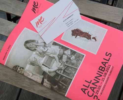
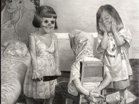
Jérôme Zonder, ‘Jeu d’enfants no.1’, 2010
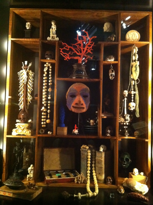
Wunderkammer, taken with my iPhone
At me Collectors Room is showing ‘All cannibals?’, an exhibition created in collaboration with, la maison rouge, in Paris. Dr. Jeanette Zwingenberger curated this show combining permanent collections of cabinets of curiosities (Wunderkammer), and collectors’ items of various media. Obviously, this show is not for the faint at heart. A lot of it is left to the imagination of the viewer. The show is not about man-eating ‘savages’. Zwingenberger reports that the exhibition is about “the imaginary, the subjective, the biological and social-political relation to oneself and to the other, form the perspective of ingestion”.
The show contains both contemporary and historical works. They are organised around the following themes: Wunderkammer, fairy tales, mother-child relationships, cannibalism and the sacred, and corporeality.
Some of photographers included in the show were Cindy Sherman, Pieter Hugo, Bettina Rheims, and Yasumasa Morimura. Besides photography, there is sculpture, painting, drawings, installation and video art. Next to the ticket booth, there’s also an interesting video of Patty Chang, ‘Melons (At a loss)’ (1998), who is seen spooning out her own breast, a cynical take on anorexia in society.
The show is fascinating for its diverse content on such an interesting concept. I really enjoyed it and found it very inspiring.